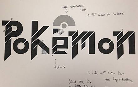
GO TO PROCESS
POKÉMON RE-BRAND
Collateral Design | Logo Design
For years the Pokémon logo has remained
the same since it’s debut in 1997. The
20 year old brand is still focused on the
demographic of children. Those children
have now grown up and this step in
redesigning the logo plays a big role in
that. The new design is to make the brand
look and feel cooler, to bring back the
once little kids who grew out of the brand.
This is to show that Pokémon is not just
for children but any age and that it’s so
much more than just cute little creatures.
This is accomplished by the starkness
of the sharp edges and the tilt of the
letters to show motion. Red and white
play a big part in the color scheme
because it relates back to the Pokéball,
a major item within the games. The hints
of the blue and yellow call back to the
original logo design to show that they still
cater to children and that demographic.
Included at the bottom is also the name
for Pokémon in Japanese (Poketto
Monsutā), this is to show respect to the
origin country of the company.
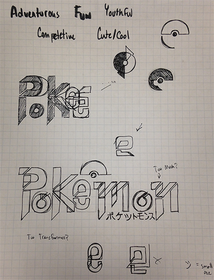
PROCESS
BACK TO TOP

The redesigned Pokémon logo grabs the attention of those who used to play back in the day, and shows a new mature take on the company brand.

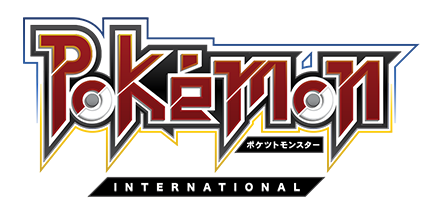

The modernized version of the logo with a metallic texture to emphasis a cool and competitive feel.

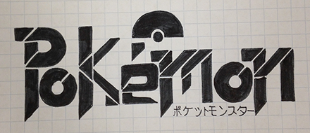
The Pokémon logo mark used in the re-brand.

Stationary system for the redesigned Pokémon company.
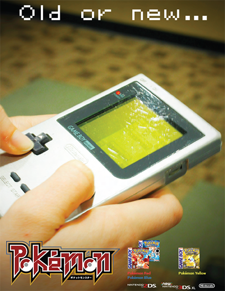
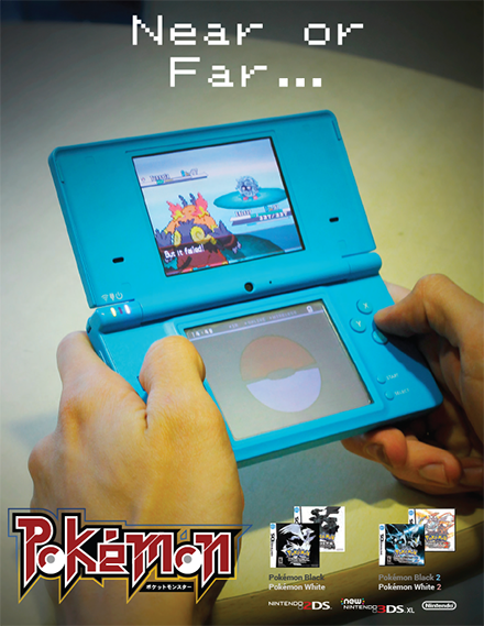
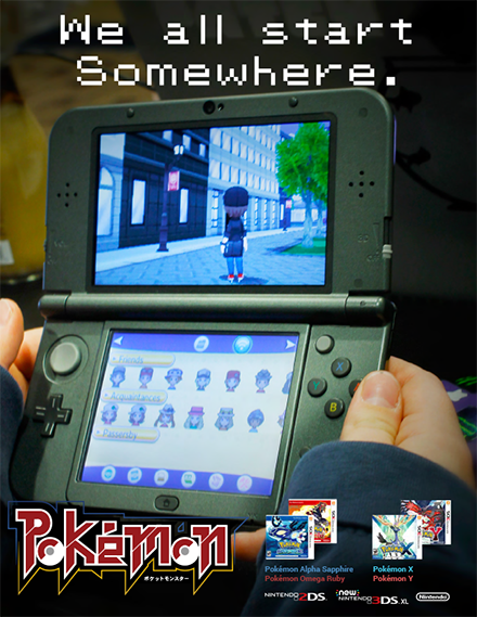
A six spread ad for the Pokémon redesign campaign. Each page is part of a sentence that have contrasting elements that showcase the different activities and audiences for the Pokémon demographic.
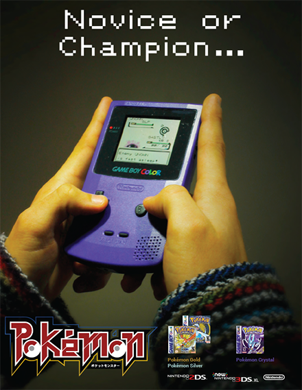

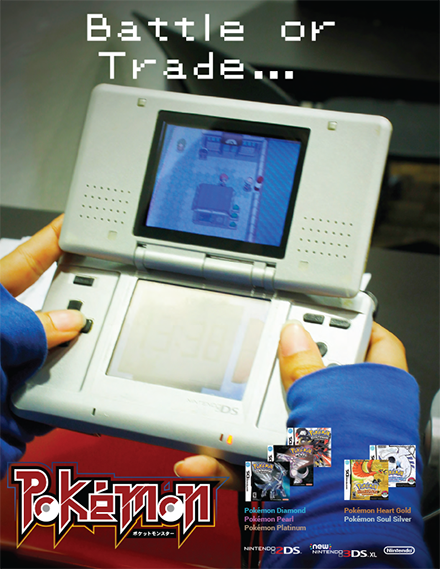
All pages show which games debuted on the various Nintendo handheld devices and showcase what games belong to each different generation in the series of games.
