GO TO PROCESS
STARBUCKS RE-BRAND
Symbolism | Logo Design
The given task for this piece was to
redesign a company that you don’t like,
whether it be the product itself or the
way it was designed. I chose the coffee
company Starbucks. The goal was to
make a new logo with the knowledge of
how we can use symbols within to
convey a message.
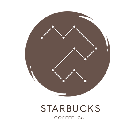
From the beginning I knew I wanted to
convey the literal meaning of the word
star buck. With some research I learned
that star buck means “great river”. For
more of a connection I wanted to see
what things are known as the great river.
I came across Eridanus, a constellation
also known as the great river. This
constellation is also based on the Po
river in Italy, which is the largest river
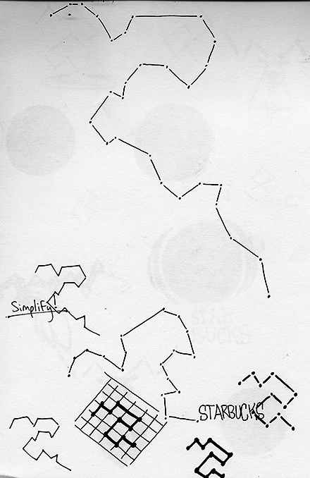
in that country. I looked at the form
of the constellation and tried to find
a way to simplify it. I took the major
characteristics Eridanus has and tilted
the image at 45 degrees.
The brown circle behind the logo reflects
you looking into a cup of coffee. The type
chosen is complementary to the logo
because it’s thickness matches that of
the lines within the logo mark.
PROCESS
BACK TO TOP

The redesigned Starbucks logo with symbolic elements of its name origin.


The modernized version.


The re-branded Starbucks pattern. It's composed of elements from the newly designed logo.

The brands ecosystem with the business cards design and stationary.

Drawing out the Eridanus constellation to develop the logo concept.

Developing more concepts and ideas with the re-branded logo.