GO TO PROCESS
RIDE TYPEFACE
Typography | Font Design
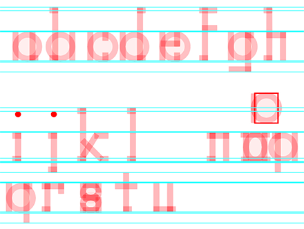
Sticking to a strict random recipe, the
task was to create a unique typeface
out of the ingredients of the recipe
given. The recipe given was Stems:
Straight, Contrast Amount: Not Visible,
Weight: Semi-Bold, Stroke Endings:
Serifs, Ascender: Longer Than Normal,
Descender: Shorter Than Normal, and
Width: Narrow.
One issue was trying to figure out the
right spacing for each letter form.
Also making sure each letter had no
contrast in weight was also slightly
difficult. Figuring out the best width
was also a challenge in itself. The end
result though is pleasing.
The concept for the vibe and name of
the typeface came from the song “Ride”
by Twenty One Pilots. During that time,
I wanted to have a beachy fun sporty
typeface that would invigorate my
audience. The application of the typeface
would be used as a display type, it is
not body copy friendly.
PROCESS
BACK TO TOP


