CREATX ARTICLE
Layout | Pre-Press | Article
Being in a group with designers, we had
to develop and write our own stories
with things going on in the Austin area
that were art related. The whole group
made and put together ideas and stories
to create a magazine. To keep with the
concept of creativity in Austin we named
the magazine CreATX, short for Creative
Austin, TX. As a large group we decided
on the grids, size of the magazine,
fonts, the masthead, and overall style
of the publication.
I decided to do my story on the Classic
Game Fest that was going on during
that time. There were going to be artist
selling their video game-related artworks.
I interviewed three different artist who
all had very interesting backgrounds
and artworks.
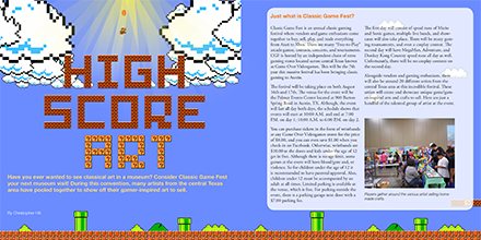
I based the style of my publication on
the Super Mario Bros. series from the
Nintendo Entertainment System (NES).
This was to go with the “classic” feel of
the whole event and reflect the gaming
culture present at the time.

All the pixels shown on the first page of the article are made individually out of squares in Adobe Illustrator.

I used the blocks from the Super Mario Bros. series to form my typography for the title of the article.

I chose an orange color to pop from the blue surrounding the borders of the publication. This emphasized the individuals and also color-coded their answers.
