GO TO PROCESS
DESIGNER as PRODUCT
Layout | Poster Design
As an experiment to break the grid,
the goal was to create a poster that
showcased our skills and would act
as a way to advertise ourselves as
designers. I wanted to showcase what
I was discovering at the time with my
skills in Adobe Illustrator. Concepting
and planning the layout were the hardest
part of this project. I didn’t break the
grid very much but the end result came
out satisfactory.
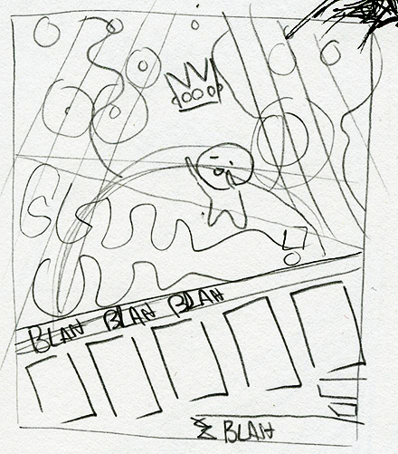
The idea behind the illustration was a
play on my last name “Hill”. The thought
was making my clients feel like they were
the king of the hill. The crown appearing
is representing me giving the client what
they need or want. The stick and blanket
represent a scepter and a cape, the cape
is purple to represent royalty.
Throughout the checkerboard I
have elements that appear from the
illustration. This is to give the poster
depth and give a 3D space in which
the information resides.
PROCESS
BACK TO TOP

The complete poster showcasing my illustrative skills within the Adobe Illustrator program, as well as a list of skills that I can perform.

A detailed view of the style of illustration used for this poster. It’s flat yet colorful at the same time.

A mock-up of how the poster would be displayed printed out.

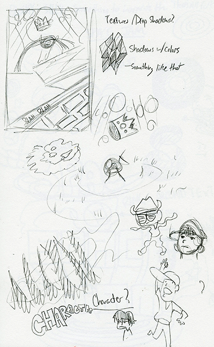
Process sketches featuring how I came up with the style and layout of this piece.
