PLAYER 1 MAGAZINE
Layout | Article | Publication
Sticking strictly to a grid, this task
required us to make a magazine cover,
table of contents, and an example spread
as one of the top stories. The main focus
of the cover was featuring how, at the
time, the Nintendo WiiU was struggling
as a successful product. I came up with
an illustration that showed the main
game series that fueled the WiiU’s sales.
This was done to further emphasis the
main story in the article. With the logo I
wanted to show something a bit retro but
modernized stylistically. The pixels in the
masthead demonstrate this.
The table of contents was to emulate the
old school feeling of playing games in the
arcade. Each system and hand-held is
color-coded, with the major stories being
the highlighted images. The line motif
shows up in articles to show what section
of the magazine you are in. Each section
is blocked off and set on a strict grid to
show order.

The blue in the masthead shows in the main article title boxes as well. This linkage technique makes the cover unified in style.

The TOC shows a uniformed order even with a lot of information, the colors help differentiate each section.

The dynamic artwork at the beginning is strategically placed to get you excited about what you are about to read, it’s a little shocking to see at first.

The spread shows off the rich environments in the video game artwork, the blue line draws your eye through the article and makes a nice contrast from all the red used in the article.
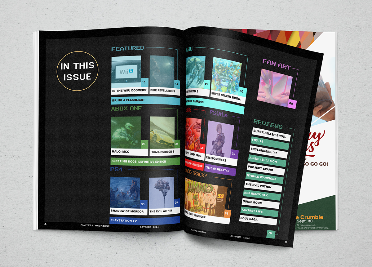
A mock-up of the TOC with an ad behind.

A mock-up of the featured story, showing the proof of concept.