GO TO PROCESS
PLUCKER'S RE-BRAND
Branding | Layout | Collateral
The main focus of this brief was to bring
new light to a local company through
redesigning it’s logo and overall brand.
Plucker's has been a staple in the Austin
community, providing excellent food and a
great sports environment. My goal was
to bring new life to this company and
make it seem like its more rooted and a
bit upscale.
A way I compare this redesign is that
I want it to be somewhere between
Dunkin’ Donuts and Starbucks Coffee,
not too high-class but not too everyday,
a nice middle ground. I wanted to make
something organic and original with the
new logo type. Hand-crafted, the type
shows a fun side while still being classy.
The chicken is added to give a strong
face for the brand, a silhouetted chicken
is bursting with class compared to the
previous chicken, which was depicted
as a cartoon.
Being in Austin means you’re also in
Longhorn territory. The orange color
comes into play not only to show that
the company is Austin’s own, but to also
emulate the color of the fresh cooked
chicken they make for their guests and
the sauces that accompany them.
PROCESS
BACK TO TOP

The opening page shows the diverse color palette derived from the orange base color.
A commercial showing off the environment and food at the Plucker's establishment as well as the features available at locations.
The new Plucker's logo and logo mark.

The Plucker's logo pattern.
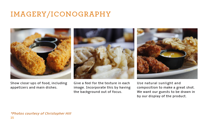
Photos taken by myself to show the mouth watering appetizing meals available at the establishments.

Comparisons of the old logo and the newly designed one.

Showcasing the business cards and having them used in mock ups.

Showing diverse advertising that play on phrases associated with the playfulness of the brand.


