GO TO PROCESS
THE GIRL WITH THE DRAGON TATTOO TRILOGY
Art Direction | Packaging
A major condition in this brief was to keep the demographic in mind when redesigning a book series set of three. It had to be catered to a specific group that didn’t previously match who would read the books. The Girl with the Dragon Tattoo trilogy is an excellent series to redesign. My demographic was young adult gamers.
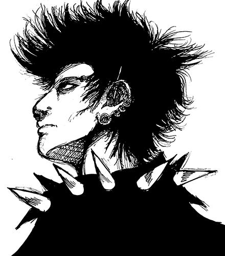
I began thinking about artwork that would appeal to a mature audience. That’s when Yoshitaka Amano from the Final Fantasy series clicked in my head. The artist style is fluid and minimal that it appeals to many age groups. I wanted to capture that essence with these book covers. I briefly read each book to get a synopsis and draw out main characters and ideas from each book and the series of events that happen within them as well.
After that was decided I wanted the colors on each cover to match the meaning behind each title. Green was chosen for the dragon tattoo, orange for fire, and blue for hornets nest to show the insects cold nature. Each book cover also had a small tad of texture in the dark areas. When all three books are lined up they form an image of the main character, Lizbeth.
PROCESS
BACK TO TOP

The spine’s complete image, forming a profile of Lizbeth, the main character.

The illustration from the first book. Each book cover features a color scheme that is based on the book’s title.


Enjoying snacks and listening to music while reading the series, if this were advertised.

Each book has a different illustration that showcases the main characters journey.


